BlackToe Running Inc. — New Store Launch Signage for Ottawa's Running Community
When a specialty running retailer prepares to open a new location, the signage needs to do two things: announce the brand to the neighbourhood and build anticipation before the doors even open. That's exactly what Lundon Calling delivered for BlackToe Running Inc.'s new Ottawa storefront.
The Challenge
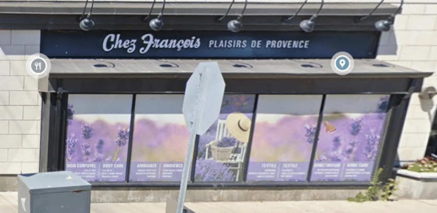
The storefront was previously home to Chez François Plaisirs de Provence — a French-inspired boutique with ornate script lettering, lavender field window graphics, and a soft, romantic aesthetic. The entire storefront was wrapped in purple florals, body care categories, and Provençal imagery.
BlackToe Running needed a complete identity reset. The space had to go from artisanal Provence to athletic Ottawa — and it had to happen fast, with signage installed well before the Fall 2025 opening to start building buzz in the neighbourhood.
The location itself is strong: a stone-clad commercial building on a high-traffic Ottawa street with excellent pedestrian visibility. But every trace of the previous tenants had to go.
The Solution
We delivered a full signage package that completely transformed the storefront:
Pin-Mount Acrylic Letters
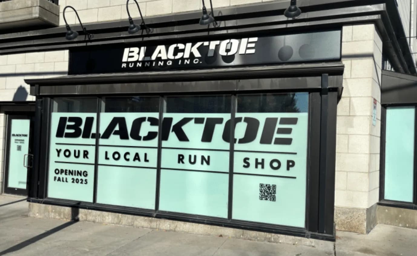
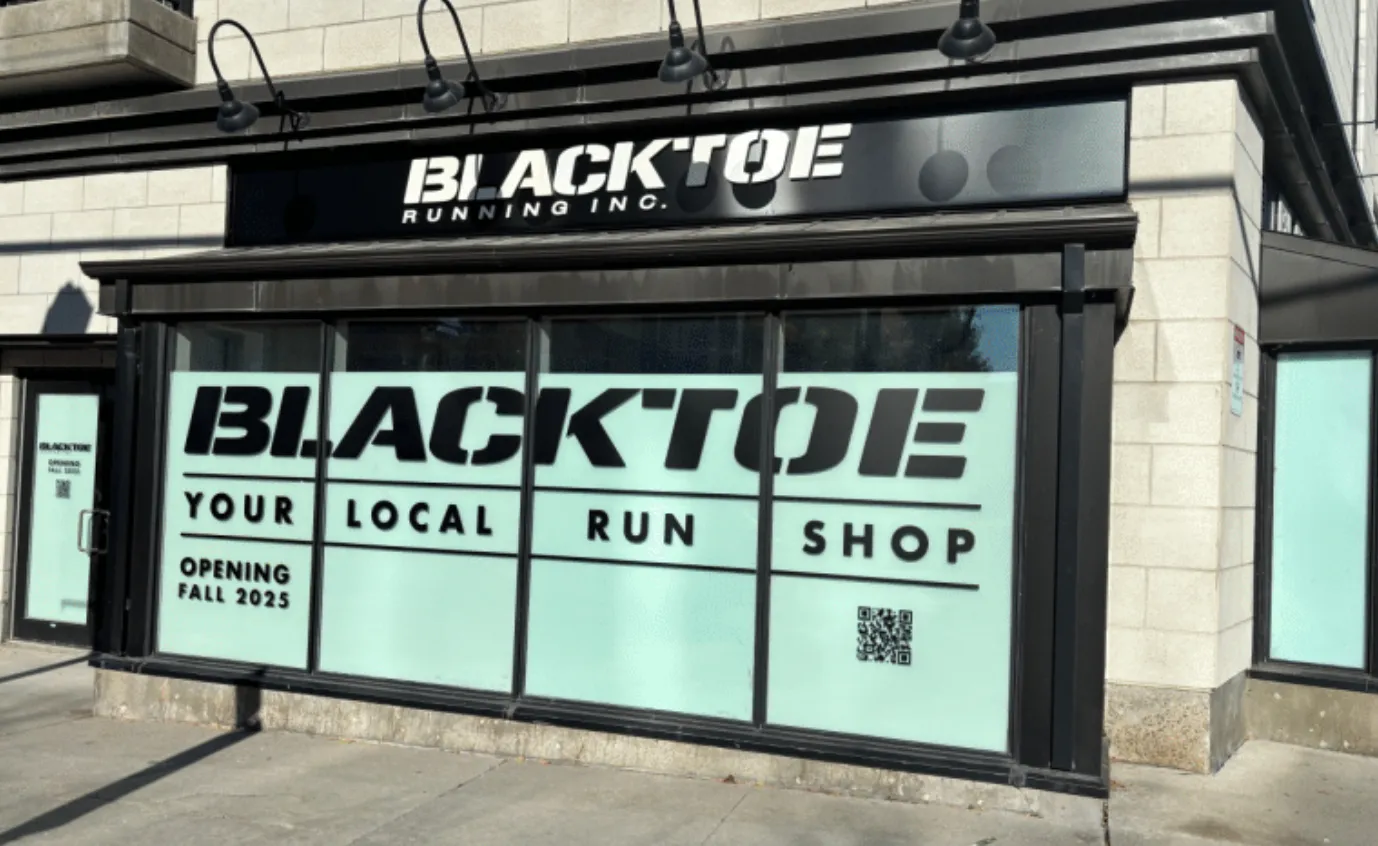
The main building sign features "BLACKTOE RUNNING INC." in bold, pin-mounted acrylic letters on a dark fascia panel. The letters are white with a dynamic, speed-inspired typeface that reflects the brand's athletic identity. Pin mounting creates a dimensional, floating effect with subtle shadow — far more impactful than flat vinyl lettering.
The gooseneck lights above the fascia provide evening illumination, ensuring the sign is readable during early morning and after-dark hours when runners are most likely to be out.
Window Graphics
The four large storefront windows received a coordinated graphics program:
- Brand identity: The BlackToe logo reproduced at large scale across the windows
- "YOUR LOCAL RUN SHOP": Clear tagline messaging split across four panes — bold, readable from across the street
- "OPENING FALL 2025": Pre-opening announcement with QR code linking to their website for email signups and updates
- Mint green frosted film: A clean, modern backdrop that provides privacy during build-out while maintaining a polished, intentional look from the street
The mint green colour choice is strategic — it stands out sharply against the grey stone facade and dark trim, creating a fresh, energetic contrast that aligns with the running/fitness brand identity.
Pre-Opening Strategy
This is a detail many retailers overlook: the signage went up months before the store opened. That means every person walking or driving past the location for weeks was absorbing the BlackToe brand, reading the tagline, and scanning the QR code. By opening day, the neighbourhood already knew what was coming.
This is signage working as a marketing tool, not just an identifier.
The Transformation
Before
The same storefront under its previous tenant — Chez François Plaisirs de Provence. Lavender fields, cursive French script, and Provence-inspired window wraps. Beautiful for what it was, but completely wrong for a running store.
After
Bold athletic branding. Clean lines. High-contrast mint and black. Pin-mount dimensional letters. A storefront that screams speed, community, and purpose.
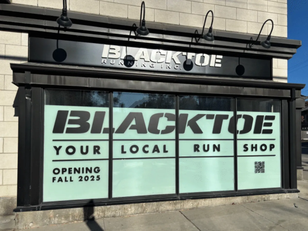
Same building. Completely different energy. That's what professional signage does.
Opening a New Retail Location?
Your signage should be working for you before you even open the doors. Pre-opening graphics build anticipation, establish your brand in the neighbourhood, and drive early signups. Lundon Calling handles the full process — removal of existing signage, design, fabrication, and installation — on your timeline.
📞 (613) 854-9255 🌐 lundoncallinginc.com 📧 info@lundoncallinginc.com