
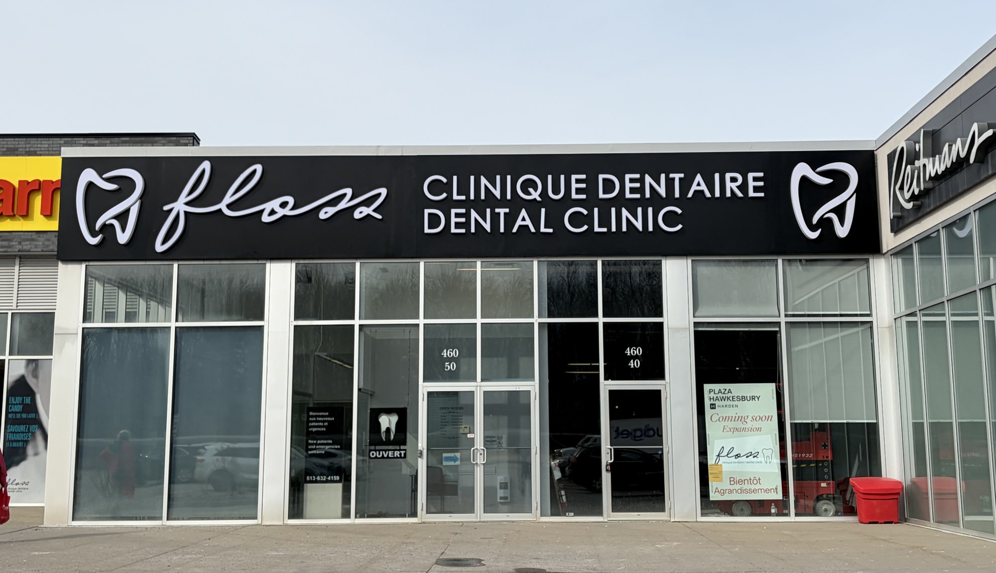
Floss Dental Clinique Dentaire, Hawkesbury: Bilingual Channel Letters with RGB LED Tooth Logos
When Floss Dental expanded into the adjacent unit at Plaza Hawkesbury, they needed a storefront that read clearly from across a busy commercial parking lot in two languages, held its own against neighbouring national tenants like Reitmans and Mark's, and felt like a modern dental brand rather than a strip-mall clinic. The sign also had to work as hard at 9 PM in a winter rainstorm as it does on a bright Sunday afternoon.
The Setting
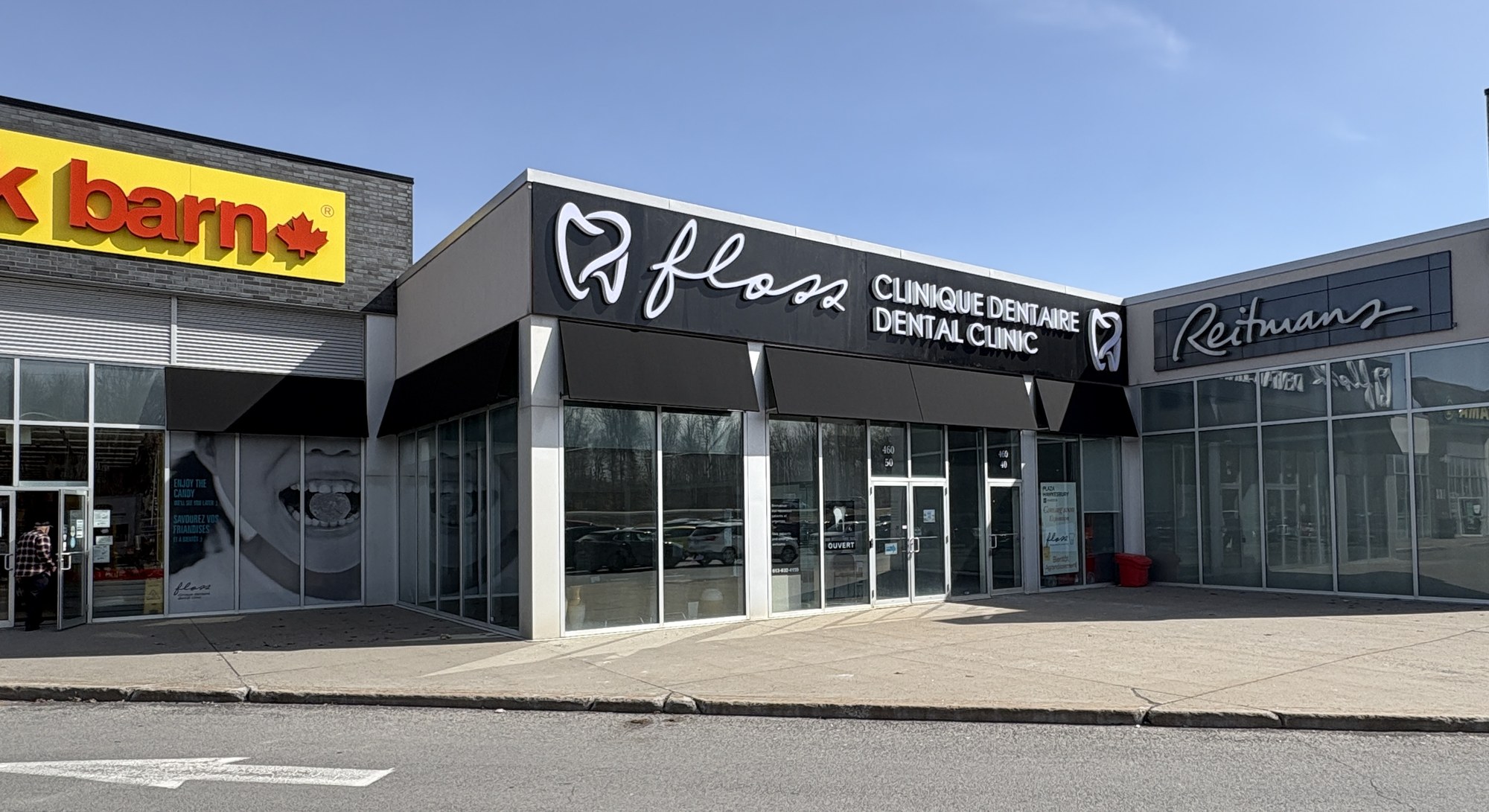
Hawkesbury sits at the eastern edge of Ontario, right on the Quebec border, in one of the most consistently francophone corridors in the province. Plaza Hawkesbury at 460 Spence Avenue is a standard-format suburban commercial plaza - national anchors, a busy parking lot, and a fascia band where every tenant sign competes for attention in the same fixed architectural frame.
Two practical constraints shaped the brief:
The fascia was shared with adjacent units. The sign had to fit within a fixed width, sit flush inside the plaza's existing architectural band, and respect the sightlines into Reitmans and Mark's on either side. No bleed, no creative excuses.
The clinic is open into the evening. In a suburban plaza where the parking lot is poorly lit by 7 PM in winter, storefront visibility after dark matters more, not less, than it does on a downtown Ottawa street with ambient city light.
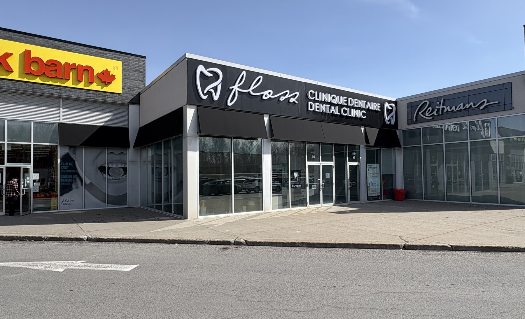
What We Built
The fascia is a 1/8" black ACM sheet bent into a 2" pan and running the full width of the unit. The brand elements break down like this:
Two illuminated Floss tooth logo medallions flank the wordmark. These are halo-lit channel forms with RGB LED interiors - the signature element of the whole installation.
The "Floss" script wordmark in white face-lit channel letters, centred on the panel.
A two-line bilingual lock-up in white face-lit channel letters: "CLINIQUE DENTAIRE" on the top line, "DENTAL CLINIC" directly underneath, same size, same weight, same construction.
A matching black awning above the entry doors ties the storefront identity back to the fascia band.
By day, the look is restrained: bright white letterforms on matte black, tooth medallions reading as crisp white outlines. No visual noise. The clinic reads as a healthcare brand, not a quick-lube franchise.
Day to Night: What the RGB LED Does
By night, the personality changes entirely.
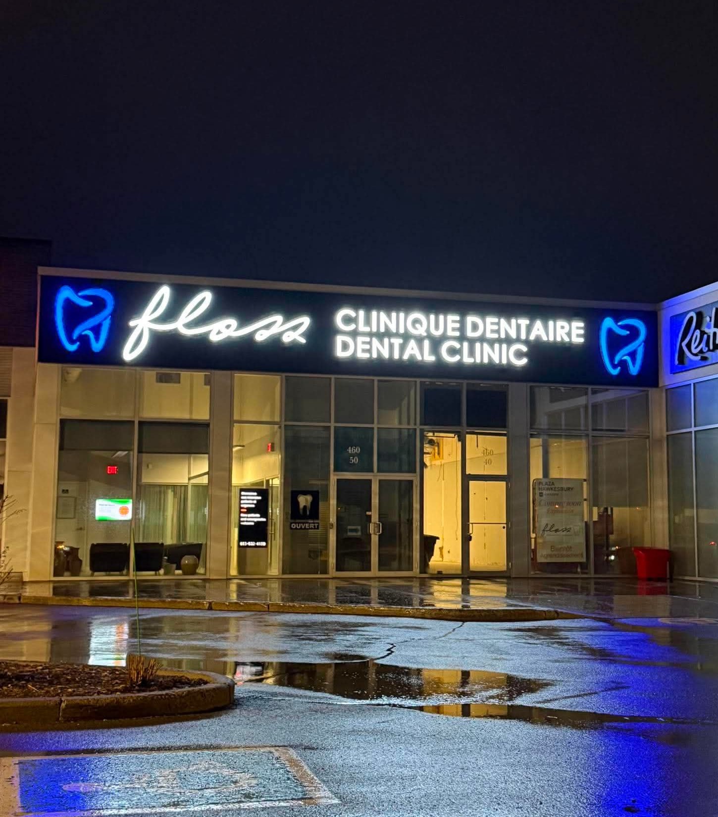
Both tooth logos are RGB LED, controllable by remote to any colour in the spectrum. In our night photos, Floss has them set to a deep medical blue that throws a soft glow onto the storefront columns and the wet pavement. The wordmarks stay clean cool-white. The result is a storefront that can present two completely different moods depending on the time of year or what the clinic wants to signal: blue for everyday operations, pink for Breast Cancer Awareness Month, red and white for Canada Day, green for December. None of it requires a service call. It's a button on a remote.
A standard single-colour white LED channel letter does its job - it illuminates the brand at night and lasts a long time. But it's a fixed asset. The clinic lives with whatever colour temperature was specified at fabrication for the entire life of the sign. RGB converts the sign from a fixed asset into a flexible one.
For a dental practice in a competitive market like Hawkesbury, where the brand will want to participate in seasonal awareness campaigns and stay visually fresh year after year without recapitalizing the signage, that flexibility pays off quickly. The incremental cost over a single-colour LED build is modest. The incremental marketing surface is not.
A few things worth knowing if you're considering RGB for your own storefront:
- Colour consistency over time. Cheap RGB strip looks great on day one and shifts noticeably within 18 months. We spec commercial-grade modules with bin-matched diodes so the blue you set today is the blue you see in three years.
- Spare the remote. The remote is a single point of failure. We pair the install with a labelled spare and documentation so the clinic isn't calling us on a Saturday night because someone misplaced the controller.
- Power draw. Modern RGB LED modules run comparable wattages to single-colour at this scale. Hydro impact is negligible.
Getting the Bilingual Hierarchy Right
In Eastern Ontario and Western Quebec, you cannot treat French as decoration. Done badly, a bilingual sign reads as a compliance afterthought: French in smaller type, French as a subheading, French in a lighter weight. Patients notice. Local pride is real.
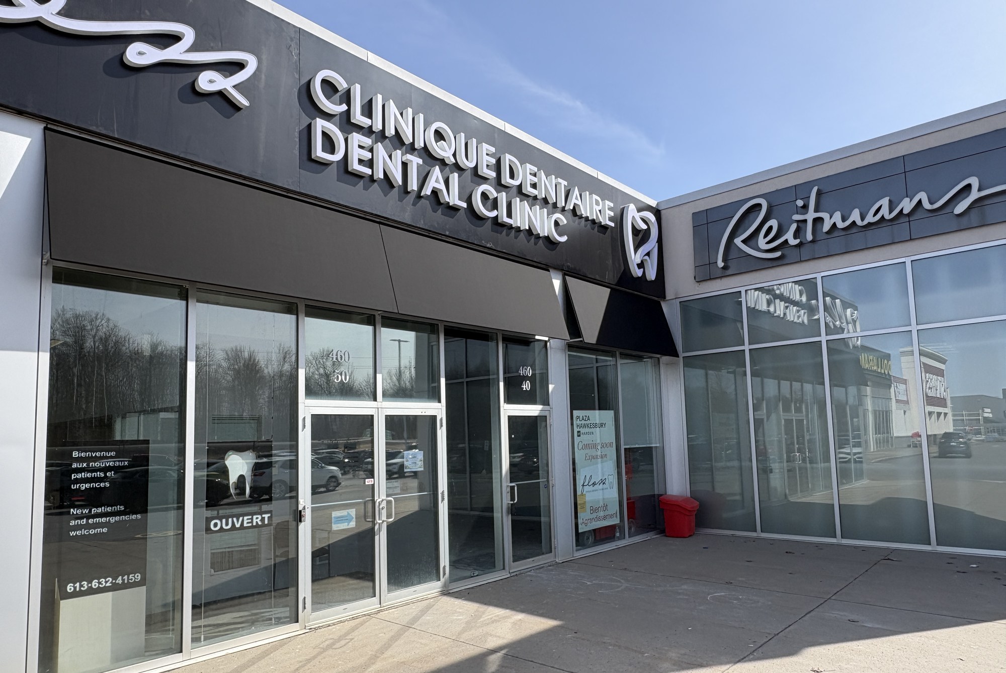
The Floss fascia treats both languages as equal. "CLINIQUE DENTAIRE" sits on the top line because that reflects the working language of most patients at this location. "DENTAL CLINIC" sits directly underneath in the same weight, same point size, same face-lit channel construction. The hierarchy is informed by the local market, not by which language the sign vendor finds easier to set.
The same principle carried through to secondary signage: door decals, the entry "OUVERT" sign, and the temporary window notice during build-out. Same weight, same clarity, same brand throughout.
A Note on the Awnings
The black canopy awnings over the storefront windows were installed by a different vendor and predate our scope. The matching black awning above the entry doors is ours. This distinction is worth flagging because it illustrates how a commercial signage project actually fits together on a real site.
Building owners, property managers, and tenants often have several trades touching the same facade. Our job is to make sure our work integrates cleanly with what's already there, and that what we add reads as part of the same family. The 1/8" ACM pan fascia, the door awning, and the pre-existing window canopies all sit in the same matte-black register. Coordinated, not coincidental.
Scope and Timeline for a Similar Project
For a clinic or retail tenant considering a comparable build, here's what to plan for:
Permits. A fascia sign at Plaza Hawkesbury requires a sign permit from the City of Hawkesbury, plus landlord approval before the application goes in. We handle both.
Design. Locking the brand lock-up, sizing within the available fascia, and working through day and night colour treatments. Two to three rounds of revisions is typical.
Fabrication. Aluminum returns, acrylic faces, LED modules, transformers, and mounting hardware, built in our Ottawa shop. Four to six weeks depending on queue.
Installation. Lift and three-man crew. The Floss fascia was a single-day install, with the awning and door graphics finishing the following morning.
Handoff. RGB remote, labelled spare, warranty documentation, and a direct contact if anything goes sideways in the first year.
Planning a Storefront Sign in Eastern Ontario or Hawkesbury?
Lundon Calling handles dental office and healthcare signage across Ottawa, Eastern Ontario, and Western Quebec - design, permits, fabrication, and installation in-house, in both languages. If you're opening a new location or refreshing an existing storefront, contact us for a consultation.
📞 (613) 854-9255 📧 info@lundoncallinginc.com